Every bookworm avid reader understands the seductive powers of books. Books have an enchanting nature. Being around them fills us with an unsatisfied desire the consume more. There’s even a self-help book for biblioholism. It’s entertaining for sure. But it thus far does little to help me overcome my addiction. I think it actually added fuel.
Tom Raabe’s book starts with a little anecdote about how he has “total control” over his addiction. He has good reason to possess multiple copies of the same title. They’re different editions, after all. But then the unthinkable happens: he finds two copies of the same book. Same edition. Same publishing company. That’s when he admits he has a problem.
Thankfully, my own addictions haven’t gone that far. Yet. I moved around too much in college, and now, living out of my car, I’ve been forced to choose a select few to journey with me.
Like that’s an easy decision to make.
One good thing about being broke is that it makes it easier to avoid the books’ whispers for attention. I tend to be extra picky with my tastes in books, anyhoot. Rather than gobble up anything and everything that crosses my path, I’ve developed a pattern where I shift from one series to another.
Yes, Book, I Judge Thee
The only independent novels I seem to enjoy are ones that come with high recommendation from closely-trusted friends, or classics I pick up because “everyone” has to read them—or at least be acquainted with their stories.
Despite that age-old saying to not judge a book by its cover, I do. I can’t help it. I’m a visual thinker. Book covers are as crucial to my decision to open them as titles and opening paragraphs. I like my books to be pretty, or at least give me an idea about the style/tone of a book. The visual cues therefore must give me a sense of the book’s contents, or else I’ll pass it up for the next book on the shelf.
Book Art Sets Tone
That said, when I first set eyes on the latest edition of Gregory Maguire’s Wicked, I knew I needed it. The new cover is simple and elegant. It reminds of an historical fiction novel, actually. It features a young woman, Elphaba (the Wicked Witch), standing on a hill. The colors are sullen—neither too bright, nor too dark.
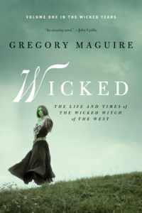 Having read the book already, I feel that the new cover sets the story’s tone a lot better than its original cover art. It’s a serious piece, expressing an alternative perspective on the “life and times of the Wicked Witch of the West,” which is far from being cheerful, or even outright evil.
The novel depicts those fabulous grey areas to which I’m constantly drawn. Nothing is purely black or white. Elphaba has a past that reveals more than the simplistic villain who kidnaps Dorothy Gale. There’s a reason she wants those slippers, and it’s not just because it belonged to her sister.
Though the Broadway adaptation of Wicked lightens the tone and fills it with family-friendly elements, the novel itself is meant for an adult audience. There are questionable situations and scenes best left to mature readers (just my humble opinion, of course). For that reason, I believe the new edition’s cover is more suitable to its content.
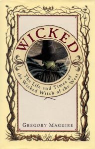
Not that the original cover art sucks. It just gives the wrong impression of Maguire’s twist to the childhood tales.
Cover art is influential. So use it to your advantage.